Two of the most famous paintings from Germany’s Romantic period are back on display at a central Berlin museum after a two-year restoration. I recently visited that exibition and appreciated the famed landscape painter Caspar David Friedrich.
The Monk is back. The making of a perfect piece of art has always been a purification process of the artists soul. Especially in Romanticism, in which artworks supposedly not only depict an object, but represent holistic the artists inner side: artwork and artist converge in the Ego. As defined by C.G. Jung, probably not the Ego alone, but the personal and collective Unconscisiousness and finally the Self. When the Artist finished his work, he knew that gods and humans alike would feel pleasure when they see the painting.
“The Monk by the Sea” (“Der Moench am Meer”) Caspar David Friedrich
True. Crowds clustered araound the paintings “The Monk by the Sea” (“Der Moench am Meer”) and “The Abbey in the Oakwood” (“Abtei im Eichenwald”), which were created as a composite work. Investigation of nature, incorporated always proportion, harmony, and unity. Similarly, in his Metaphysics, Aristotle found that the universal elements of beauty were order, symmetry, and definiteness. That was clearly revived in Caspar David Friedrich’s art. What is perhaps the most famous Caspar David Friedrich,”Monk by the Sea”, was completed in 1810, and is large-scale oil paintings in landscape mode 175 x 110 cm. That painting the Monk by the Sea (Der Moench am Meer) has an impressive usage of line and space, but also “uniformity and boundlessness”, as Heinrich von Kleist once remarked: “Nothing can be sadder and more uncomfortable than this position in the world: the only spark of life in the vast realm of the dead the lone center shared circle the picture, with its two or three mysterious objects like an the apocalypse, as if it had Edward Young’ Night Thoughts. And, since it in its uniformity and boundlessness it has nothing but the frame in the foreground“. This sentence was written by the poet Heinrich von Kleist one year before his suicide in an review of this painting “Monk by the Sea”.
Psychoanalytic interpretation
In my humble opinion, this painting of the central Berlin Alte Nationalgalerie on Berlin’s Museum Island, is also a showcase, both for photography and psychoanalytic interpretation. Where are your leading lines directing you? Well – to infinity. There is only on vertical in this painting, that is, that silhouette of the monk. In fact, so I reaffirm this psychoanalytic formulation, the painting has something visionary. It offers an insurmountable simplicity in the composition. Three horizontal zones divide the painting: the sky with raspberry mist, black sea and almost white sand, each delimited by the yank edge and the horizon. The only vertical line is the monk, a point, a human counterpart to the vastness of nature – in the void. Exceptional the human: Upright and defenseless.
“The Monk by the Sea” (“Der Moench am Meer”) Caspar David Friedrich
In his painting, Friedrich steps over all valid rules of landscape painting or a landscape photography, more radical than ever before. There is now nothing more to see. The creation has no perspective, no depth anymore, the narrow dunes shore is just a whitish stripe, that rises at an obtuse angle to the left and from the apex. By the monk, the only vertical line, the dunes shore decreases to the left. In a traditional landscape, the foreground is kept dark, only in the middle distance, the colors are lightened up. Exposed on the horizon, abruptly drawn as with a ruler, and extremely low in between the narrow dark strip of water, is actually: nothing
This is because the image is composed almost entirely of heaven. Up to the horizon line one can find some orientation, because there are still proportions visible, especially the monk.
He represents something like a scale, but embodying the background no proportion can any longer be detected
The background clearly represents the non-measurable, the unconsciousness, the spirituality in nature. This refers to the shoreline because the sky seals over the deep blue in a way that the shoreline is mirrored at the height of the monk figure. All lines literally flee like rays, from the middle of the painting and also the blue awakens the illusion of depth. An impression of bright clouds just above the monk separates the horizon line sharply and creates two zones. The land-maritime zone ínteracts like one, single surface starting at horizon.
The monk vertainly represents Friedrich himself, according to the romantic ideal that every art has to show the inner form of the artist – paintng and artist are the same. Or on other words, the artist paints, what he sees in himself. No wonder, das this art can be easily related to C.G. Jungs concept of our inner world.
Lines
From the worn out “rule of a third” in photography composition, only the horizontal division is viable: pre-foreground, middle ground, background. Each is associated with a natural element: Air, Water, Earth. Drastically, the sky occupies five sixth of the image. Any limiting scenes, like rocks, shrubs, trees or a main motive to frame and highlight is missing. Only the wooden frame limits the image content. This creates openness to all sides and the impression of virtual infinity. As an infrared photograph has shown, Caspar David Friedrich painted over two ships, in the interests of this elementary space and line experience. The deliberately thoughtful, geometric composition of the painting receives its special emphasis through two successful Invasions: The monk is placed by the painter on a little promontory, which protrudes into the sea, like lighthouse. Geometrically his horizontal position conforms to in Golden Ratio , which – in accordance with a classical Cartesian theory of proportions was the harmony ideal of Greek art. The golden ratio (“sectio aurea”) is the division of a straight line in two uneven portions such that the entire route to greater leg behaves like the greater part of the route smaller leg.
Golden_ratio_line
This golden ratio, also known as the divine proportion, golden mean, or golden section, is a number often encountered when taking the ratios of distances in simple geometric figures such as the pentagon, pentagram, decagon and dodecahedron. In mathematics, two quantities are in the golden ratio if their ratio is the same as the ratio of their sum to the larger of the two quantities or: a+b to a as a is to b. The figure on the right illustrates the geometric relationship. This image outlines generated more excitement than the central axis. If you follow the shore line, one ends on the horizon, the other on th border of the clouds and blue sky.
Colors
There are no contrasting colors, which stand out significantly from one another, dominate the picture, but an uniform gray tone with flowing transitions. The image is designed tone on tone. Whitish-brownish extends the sandy beach. Leaden grayish, to almost black surging water. Variations of blue and gray piles up the sky. It gives a gloomy, uneasy feeling, very much the opposite of the light in French impressionism. Well, it is the North Sea with dark water, in pale, melancholical light.
“The Monk by the Sea” (“Der Moench am Meer”) – cut
The land lacks any vegetation, just a barren soil. The blowing of the wind and the noise of waves and a cold breath of unconsciousness seems to meet us. The monk looks vulnerable and lost with himself and the infinity. Although small and fragile, he is not meaningless, because he is the only living creature, aware of the situation, the only vertical in a structure of horizontal. No object no without observer. The Monk represents the opposite of infinity – mortality and consciousness.
Symbolism
The Abbey in the Oakwood
The Abbey in the Oakwood (German: Abtei im Eichwald) is the oil painting by Caspar David Friedrich adjecent to the “Monk by the Sea. It was painted between 1809 and 1810 in Dresden. The ruin is again the golden ratio; the dead trees rise up to the sky.
The Western Monasticism is often not characterizes by contemplatives alone (except strict orders) like Sufism. Benedikt von Nursia, the father of Western Monasticism created that proverbial: “Ora et labora”, pray and work. In other words, following Max Weber’s great sociological-religious studies, rationality and spirituality merge.
Caspar David Friedrich’s painting “Monk by the Sea” has psychological content. It represents the existential fundamental loneliness of man in the universe. A modern, a worldly symbol of the finite ego as guest of the infinite. Both literally and figuratively located in one the “border situation” on the Land border and in the face of centreless limits. It is increasingly strengthened and reaches finally this extreme situation, which may, as C. G. Jung believed, to be the point, at which the collective unconscious opens to an “ubiquitous continuum That continuum represents “an unextended omnipresence” or the “death of the ego”. The picture shows in a metaphysical sense the minor role of the ego, the individual against collective archetypes of the unconsciousness.He also suggested that finding the Self is like a marriage which becomes rarely or perhaps never smoothly and without crises a personal relationship; “There is no consciousness without pain”. The first step to the individuality is the
break off with the unconsciousness of the herd. “It is the loneliness of mature man, who no longer ´depends on the value judgements of his environment, but in his relationship to the Self is firmly established.”
Like in another of my favorite painting of him: “The wanderer above the mist”. Both, “The “monk” in landscape mode and “The wanderer” in portrait orientation show the same basic human condition, in complementary settings, sea and mountains. The theme of the solitary wanderer and his longing for primeval nature is a common one in German Romantic literature. But Caspar David Friedrich sought to express in painting his own mystical or pantheistic view of nature. “The divine is everywhere,” he once wrote, “even in a grain of sand.” He was lonely, a serious and solitary figure, who spent most of his life alone, painting the countryside of his beloved Germany. His mysterious and haunting landscapes expressed not only a love of nature, but also an intense inner world.
Conclusion
To me, Friedrich had a truly unique style; he could transform landscapes from a mere forest to a wooded wonderland where each branch symbolized something greater, something deeper. He was an early symbolist, to early for him. His trees were no longer just trees, but beautiful wooden creatures that represented the German strength or the longing for transcendence. The rays of the sun didn’t just serve to illuminate the ground but to show the light of heaven.
Unfortunately, reception of Friedrich’s work deteriorated as he aged. Eventually even his patrons lost interest. Friedrich died while his art was no longer wanted. Critics thought it too personal to understand, completely disregarding what made the work so original in the first place.
However, his works were regarded highly later, by Symbolist and Surrealist artists, such as Max Ernst. The time took note of the allegorical meanings that saturated Friedrich’s canvases as a great source of inspiration and foundation. Carl Gustav Carus was a friend of Casper David Friedrich. Carus, a painter, nature philosopher and scientist, was seen by C.G. Jung as forerunner of psychoanalysis.
Caspar David Friedrich’s The Solitary Tree
Another fascinating painting in this room: The Lonely Tree (German: Der einsame Baum). This is an 1822 oil-on-canvas painting also by German painter Caspar David Friedrich. The work depicts a panoramic view of a German landscape of plains with mountains in the background. A solitary oak tree dominates the foreground. Notice the broken, rotten top pointing to the sky. Despite the missing tree crown, the old tree still hangs on live visible by its green leafage. The roots, supposedly symbolizing the German people and their culture are firm and deep. The rotten top represents the German elite at that time, during the counterrevolution, 25 years before the tragically failed Revolution 1848. Just like today, a rotten, broken elite, but will the tree survive this time?Not with destroyed roots.
Friedrich loved encryption but coded his messages with clear symbols: The ancient tree, perhaps a German oak, is at the very center; at his feet is a swampy waterhole, a shepherd leaning on the tree and watching over his little flock. Behind, bathed in bright light, we can see a village surrounded by pastures, bushes and fields. Far in the background rises a steeple from behind the hills, the roofs of a city are visible. The city with its gothic church towers shall be read as metaphor for the Christian Middle Age. The painting is thus divided into a row of staggered, parallel planes, from the distant past to the present.
Friedrich influenced quite a few artists. It is no surprise, that among his admirers was another outstanding painter , the Norwegian Symbolist Edvard Munch, whose work has been explicitly related to Friedrich’s. Munch could identify with Friedrich’s symbolism and in one of his work a clear reference is seen to Friedrich’s “Man and Woman Contemplating the Moon” on the left.
Caspar David Friedrich’s paintings tell a lot of the early nineteenth century, inspired by the French occupation and the Napoleonic Wars, the era of Metternichs Restoration, the connection between early nationalism, which was at that time a progessive, liberal movement. The art historian Jens Christian Jensen attaches a clear political meaning to this work: his commitment to liberal political ideas of republicans, who were prosecuted as ‘demagogues’ and disturbance.
Sources
Boime, Albert. Art in an Age of Counterrevolution, 1815-1848. University of Chicago Press, 2004
Jens Christian Jensen, Caspar David Friedrich – Leben und Werk, 1974. 10 Auflage 1995
Rüdiger Safrabski, Romantik eine deutsche Affäre, Hanser 2007
Kurt Kersten, Die Deutsche Revolution 1848-1849, Kassel 1055
As a photographer, your eye is your lens. Photography for Jungians understand there are more than five senses. This essay gives a basic understanding, why excellent pictures (paintings or photographs) succeed. After you have started exploring the world with this mindset, you’ll find, that you automatically begin to see things differently. I derived (better adapted) this photographer framework from the two excellent books by the Swiss photographer Martin Zurmuehle, “The magic of outstanding pictures”.
In a way this essay is excerpt an my interpretation of Martin Zurmuehle’s two books on this subject. He explores, how a viewer (or a jury) evaluates the quality of a photograph,and argues successfully, that quality methodology and communication theory can be employed, to plan, execute and select the best shot objectively. Jung would even argue a point further, there are conscious and unconscious (personal and collective) factors, which influence the reception of a picture – cultural pattern, like symbols and recent Zeitgeist or deceiving symbols (e.g. propaganda or fashion fads).
The framework below shows the process. The photographer starts with his/her objective (value statement) and enters the inner or outer circle at any (interdependent) segment:
a certain technique is selected, a suitable formal composition chosen to create a particular effect
a motif may trigger an idea, how to achieve a certain reception (from a particular target group)
For example I choose often a technique – IR photography or am intrigued by a certain motif. Or you start with a target group (in marketing) or the effect and so on. Photography obviously is also concerned with communication – the goal is to communicate something from the photographer to the viewer:
Content: facts, motif, subject or object and used communication technique.
Sender: photographer’s self , his/her idea, personal style by selected formal aspects.
Receiver: desired reception from target viewer within “zeitgeist” to storyline or emotions.
Photography teaches us to appreciate our world—visually at first, but also emotionally—in a whole new way. Actually that article started for my visual blog, but somehow it went on the psychoanalytic side.
Define the quality of a photo
Structured Evaluation of Photos
To judge photographs, and to do better ones,it is necessary to develop the skills to make careful visual analysis. While everyone can easily discuss the contents of photographs (“what you see”), most need more training to learn about formal analysis used in the visual arts. Formal analysis focuses on an artwork’s “formal” qualities, or those visual elements that give it form. Formal analysis provides a basic common language in the visual arts. However, a description of a photograph based only on formal analysis would be incomplete. Photographers make many decisions both about composition (arrangement of visual elements) as well as effect (meaning) when taking photographs. Consequently, it is important to consider the artist’s goals for making a photograph of a particular subject. Finally, the reception (historical and cultural context in which a photograph was made) must also be carefully considered.
There is no one unique answer when interpreting works of art. Art cannot be measured against a specification, but it can be evaluated in a structured and objective way. It is still more of a benchmark and must be based on experience. There are several ways to define quality of a photograph beyond personal taste, the latter more often than not utterly misleading:
Intuition Based: Photographer, artist or experienced person just knows;
Balanced Score Card: Structured evaluation based on pre-defined criterion (such as a quality system);
Model based: Interaction evaluation (effect/impression) on viewer, such as a visual communication paradigm.
Professional photographers with a trained eye, indeed can judge the quality of a photo within seconds. But so do fools or pseudo-experts, which reflect only the inconsistent view or are slaves to Zeitgeist and marketing. If you are neither, but like me. understand that one must “measure” quality to get better, read on. Maybe you also agree with me, that digital photography moves into fine art, with more ambitious quality standards than contemporary art. I am fascinated, how psychoanalytic structures and energy clusters are expressed by digital photography and new way of movie making. That is one of my goals, to express myself this way.
Objective of Photography for Jungians
This essay gives a basic understanding, why excellent pictures (paintings or photographs) succeed. After you have started exploring the world with this mindset, you’ll find, that you automatically begin to see things differently. I derived (better adapted) this photographer framework from the two excellent books by the Swiss photographer Martin Zurmuehle, “The magic of outstanding pictures”.
To make myself clear, I am not a professional photographer nor an artist. However, I want to understand, why some pictures move the viewer, fascinate or shock us, others let us cold and indifferent. Comfortable with a familiar methodology, which I used in consulting in complex business situations, I see a benefit in formulated objectives with qualitative measurable controls and its structured evaluation.
What do I mean? Like any business or technical endeavor, you start photography with a clear vision and objective, select the right strategy and the needed resources. To reach the goal of good photo (or painting), we need the right idea, a suitable motif and a positive reception of the viewer, jury, market. The reception may be, I dare to say, either a certain group, or some professionals target fashion, hipness or Zeitgeist, sometimes even of the chattering class.
A nice motif – the subject or dominanttheme (e.g. model, landscape) – may trigger an idea, but still you need to formulate a goal – otherwise may or may not succeed with an accidental good shot. You also need to think of reception, the viewers. In any case, you must have technical skills to handle the digital camera and post-processing. This is considered, more than in fine art nowadays, a pre-requisite and taken for granted in this essay.
Effect on Receiver
Trigger emotions
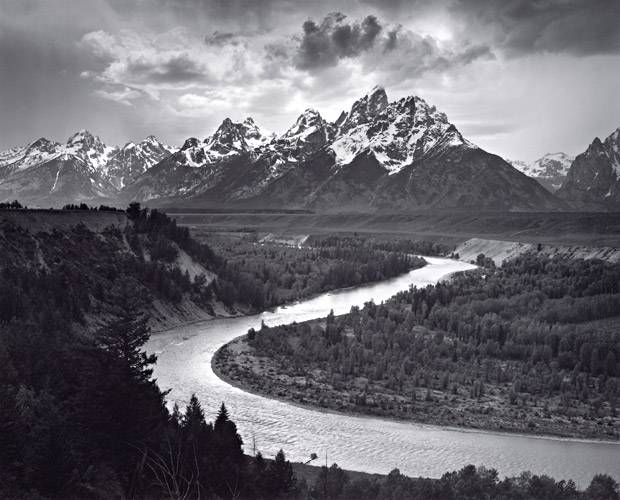
Ansel Adams photographer and environmentalist
A landscape photographer wants to capture the emotional essence of a place and show it to others. Their goal is to inspire people to travel and better appreciate the world in which we all live by showing them places that they may never have known even existed. That’s the difference between a vacation photo and a landscape one: vacation snaps are mementos; landscape shots are more advertising.
As a landscape photographer, you need to be aware of two basic concepts: what to look for, and how (and if) to shoot it. Not all great landscapes make a great photo. You need to search for strong focal points and interesting details, and apply the classic rules of photographic art—natural frames, the rule of thirds—if you want to create beautiful works out of the world. Ansel Adams was, and is, the leading landscape photographer and also an environmentalist revered for his black-and-white landscape photographs, and his commitment to the conservation of nature. Adams felt an intense commitment to promoting photography as a fine art and his images became the symbols and icons of wild America. I I backpacked lot, so I embrace his fight for new parks and wilderness areas, for the Wilderness Act, for wild Alaska and the Big Sur coast of central California, for the mighty redwoods, for endangered sea lions and sea otters, and for clean air and water. An advocate of balanced, restrained use of resources, Adams also fought relentlessly against overbuilt highways, billboards, and all manner of environmental mendacity and shortsightedness. Adams was often criticized for failing to include humans or evidence of “humanity” in his landscape photographs. Interestingly, Adams was ready for digital photography he once said “I believe the electronic image will be the next major advance. Such systems will have their own inherent and inescapable structural characteristics, and the artist and functional practitioner will again strive to comprehend and control them.”
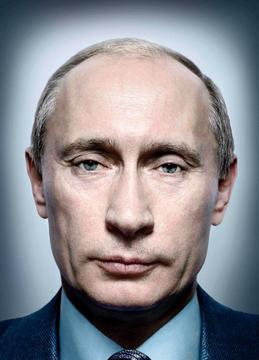
People of Power – Putin – PlatonPutin Time Cover Putin 2007
Portrait photographers are after emotions as well but, they have to go beyond the Persona, the mask.There was once a photo shoot of Russian president Vladimir Putin, which later became an infamous icon. When the world leaders at a 2009 United Nations General Assembly meeting, the were intercepted by an enterprising portrait photographer named Platon Antoniou. They could not control the results of his portrait session: in essence, they were at his mercy: “Every head of state has to address the General Assembly, and there’s a podium where they all stand to make their speeches,” said Platon, the British-Greek. “[For five days], I stood a few feet away from the podium backstage… and since everyone had to pass me on their way to and from the stage, I had two chances to secure a portrait session with each person.” Having one’s portrait taken is an intimate experience. As Shakespeare put it, “the eyes are the window to the soul.” For Platon, it is an intimate collaboration and a visual interview—both in front of and behind the camera. Having photographed world leaders, celebrities, our men and women in the military, civil rights leaders and human rights champions, Platon seeks to answer the question, “Who is this person?” His photographic portraits have graced the world’s most influential magazines including Rolling Stone, The New York Times, Vanity Fair, Esquire, GQ and The Sunday Times. Platon developed a special relationship with TIME magazine, producing over 25 cover photos.
Reach for hidden cultural pattern
Munich in Infrared – City bare of people and cars.
Cityscape photography is, in many ways, a natural counterpart to landscape photography. The same general rules apply: consider skyscrapers as mountains, roads as rivers and city lights as a lower version of starlight. The best cityscape photographers understand that cities are symbols. That is right, symbols, Buildings – churches, today banks – are symbols of power, of transcendence and so on. Look at the city paintings of Kirchner, good city photographers also understand that cities are kind of terrifying: they’re monsters that consume us in violence and loneliness. Cities change at night. A mountain is a mountain any time of day, but by night, they challenge the stars, roads light up with moving dots of red and yellow, neon lights line the streets in attempts to catch your eye. Visually, cities come alive at night. In cities, there are people. With symbols you refer to an ancient cultural pattern. Left is one of my pictures. I began experimenting with infrared, or IR, photography (mostly city landscapes). Besides normal photography, I am astro-photographer with a Canon 60Da camera. All I needed was an Hoya ND72 infrared filter. Infrared photography shares a lot of philosophy with astrophotography – patience, careful planning, accurate execution and post-processing with Photoshop. Essentially I went on a bike tour, to discover, how Munich would look, had all people and cars disappeared. How fragile a city is. Formal the road was the line. I wanted to have the lamp post in the foreground as a symbol of violence. it reminded me on an art construction I saw once in front of castle in Italy.
I am influenced by Edward Hopper and Ludwig Kirchner. One of my favorite is Hopper’s Nighthawks, inspired by “a restaurant on New York’s Greenwich Avenue where two streets meet” . The carefully constructed composition with a narrative of loneliness, has a timeless quality that transcends its particular time and place. The painting depicts an all-night diner in which three customers, all lost in their own thoughts, have congregated. Fluorescent lights emits an eerie glow, like a beacon on the dark street corner. Hopper eliminated any reference to an entrance, and the viewer, drawn to the light, is shut out from the scene by a seamless wedge of glass. Reworked and parodied countless times, Nighthawks has become an icon of American culture. Another one is the most talented and influential of Germany’s Expressionists. Motivated by the same anxieties that gripped the movement as a whole – fears about humanity’s place in the modern world, its lost feelings of spirituality and authenticity – Kirchner had conflicting attitudes to the past and present. He was inspired and intimidated by the modern city at the same time. When the Nazis rose to power in the early 1930s he was also a victim of their campaign against “Degenerate Art.” Depressed and ill, he eventually committed suicide in Switzerland. The human figure was central to Kirchner’s art and art symbolizes future and past. Kirchner’s Expressionism opposed the French Impressionism, that was dominant in German painting, Edvard Munch ( another favorite of mine – Symbolistic) was clearly important in shaping his style. Kirchner believed like C.G. Jung, that powerful forces – enlivening yet also destructive – dwelt beneath the veneer of Western civilization, and he believed that exploring the depth of humanity an the richness of cultures offered a means of harnessing them. This outlook shaped the way in which he depicted men and women in his pictures, as people who often seem at war with themselves or their environment. Now, what is art anyway? To me art works are symbolic patterns, which have connotations that are unclear or hidden. They may have interferences with the Zeitgeist and references to the past, both integrated through and with the individual artist’s situation at a given moment. Art, like the symbol has a future in a psychoanalytic sense. To the psychoanalytic C.G. Jung, a symbol is a real instance of a collective or personal archetype from the past. I am too shy to make pictures of people in circumstances. which interest me, but I have many pictures in my mind. Come to think of it, with this blog, I sort and evaluate the many pictures my mind captured during business and private travel…
Tell a story
Vietnamese-child depicted in the Pulitzer Prize-winning photograph taken during the Vietnam War on June 8, 1972.Great Depression Picture: A Mother of Seven Children
Photojournalism, or documentary photography, captures time and place better than any other form of the art. It it’s an extremely demanding form of photography, possibly the most demanding, because it requires a quick mind, careful attitude and the capability to see and tell a story. Photojournalists have to understand a wide array of photography and are close to spontaneous street shooters.Street photographers and photojournalists deal with candid shots, planned or unplanned, spontaneous moments found on public streets or political events. Documentary photos are best when they’re unfiltered, raw and human. They are cruel, like the picture of left, an iconic photo taken in Trang Bang by AP photographer Nick Ut, but the may change the world. Realist photography is an interesting art form as it doesn’t seek to “create” but rather to document intensity exactly as it is, without embellishment. Dorothea Lange took the above photograph called, “Migrant Mother” which became one of the most iconic photographs documenting the dustbowl era during the Great Depression. Interestingly Lange didn’t go to college (as was more common then) and trained herself in her style of photography. This emphasis my point you don’t need a formal education to become a huge success at a field you are passionate about. It takes empathy to photograph suffering. Lange had polio and her father deserted her at an early age. Composition of realism is often more powerful than effect, technique and Zeitgeist. If you look closely, the focus of the picture is on the hair of the child, not on the eye of the mother. That is considered as as technical flaw. Did it matter? Not only that, the picture would be powerful today, but would not be taken today. Not in Greece, with an unemployment of 25% nor in Syria, where weapon sales are up. Then the year was 1936. Unemployment was at 18%. The Dow Jones went UP 24% that year. Misery and stocks are often reciprocal correlated. Too often the headlines in the newspaper look the other way misery does not fit the narrative. Dorothy Lange took six pictures of this woman, who is named Florence Owens Thompson, but did not select a picture with all seven because she thought that would actually reduce sympathy people… Judge today’s realistic pictures – the ones, which are not taken and their substitutes.
Disclosure of Sender – Composition and personal Style
You may hear the word “composition” a lot when it comes to fine art and music. Composition has its roots in the Latin word “compositio” and refers, simply, to the way you combine the visual elements of your photo and define their relationship. This is the geometrical concept in the image, whether an object is touching the far end of the frame or in the center of the photograph. Like a music piece, a photography thrives with forms, harmonies and contrasts. Composition is a key component of photography, and art in general. There are a few ways to define them—generally, by arrangement of objects, lines, shape and color and light contrasts. Depending from your goal, static or dynamic patterns, harmonies or disharmonies, repetition or opposites will be utilized. It’s our job, as photographers, to know what designs work—what lines and circles automatically soothe or upset our minds—and find them in the real world to support our goal.One great way to find closure in ever-expanding landscapes is to look for leading lines. Leading lines are self-explanatory: they lead our eyes, usually from somewhere in the bottom of the frame to somewhere in the top third, or from one side of the frame to another.
Visual elements of a photograph:
focus: what areas appear clearest or sharpest in the photograph? What do not?
light: what areas of the photograph are most highlighted? Are there any shadows? Does the photograph allow you to guess the time of day? Is the light natural or artificial? Harsh or soft? Reflected or direct?
line: are there objects in the photograph that act as (leading) lines? Are they straight, curvy, thin, thick? Do the lines create direction in the photograph? Do they outline? Do the lines show movement or energy?
patterns: are there any objects, shapes or lines which repeat and create a pattern?
shape: do you see geometric or organic shapes? What are they?
space: is there depth to the photograph or does it seem shallow? What creates this appearance? Are there important negative spaces in addition to positive spaces? Is there depth created by spatial illusions?
texture: if you could touch the surface of the photograph how would it feel? How do the objects in the picture look like they would feel?
value: is there a range of tones from dark to light? Where is the darkest value? Where is the lightest?
How visual elements are arranged within a photograph creates the a composition.
angle: the vantage point from which the photograph was taken; generally used when discussing a photograph taken from an unusual or exaggerated vantage point.
background: the part of a scene or picture that is or seems to be toward the back.
balance: the distribution of visual elements in a photograph. Symmetrical balance distributes visual elements evenly in an image. Asymmetrical balance is found when visual elements are not evenly distributed in an image. Where to place subjects may Golden Rule, Rule of the Third (canvas section partitioning(.
central focus: the objects(s) which appears most prominently and/or most clearly focused in a photograph. Background toned down by shallow depth field
composition: the arrangement or structure of the formal elements that make up an image.
contour: the outline of an object or shape.
contrast: strong visual differences between light and dark, colours, varying textures, sizes, etc.
framing: what the photographer has placed within the boundaries of the photograph. A frame inside the image itself adds dimension and closure.It can be natural or later chosen by cropping. When we talk about natural frames, we talk about anything that creates a frame within the shot—vines, branches and trees are typical; buildings or streets sometimes work.
setting: actual physical surroundings or scenery whether real or artificial.
vantage point: the place from which a photographer takes a photograph.
How visual elements relate with each other within a photograph, also creates the a composition.
Emphasis – is someone or something – the major motif – placed at the end of the line?
Movement – lines arranged static(vertical/horizontal) or dynamic (diagonal)?
Conflict – do your lines intersect?
Depth: make your canvas look larger with a shallow depth of field.
Opposition – are some of the subjects opposites?
Geometric pattern – triangle combination, symmetry or asymmetry?
Infinity – if your lines circle inside the frame, what visual effect does it create?
Negative space is another crucial aspect to photographic composition. Often black or white, is the space not filled by anything—a clear blue sky, or a blank wall. Often it can be a powerful statement on its own, or simply accentuate the subject of the photo. If the the subject isn’t centered, lines need to lead. Composition is one of the thing, where you can your personal style.
The Message – Motif and Technique
Now, anyone can buy a Canon EOS 5D Mark II – which I happen to have – and take shots on automatic, but if you want to really delve into what makes the photo special, you need more to understand its points of autofocus, its full frame sensor and its white balance modes. To take good photos, you need to control only three things aperture (f-stop), shutter speed and light. Aperture controls depth of field.
The wider your aperture, the shallower your depth of field—f/1.4, for example, is a very wide aperture, so your camera lens will be wide open, if you want a deeper depth of field, you’ll need a narrower aperture—something like f/16, which will create a consistently detailed image. Typically, when capturing cities and landscapes, deeper depths of field are more desirable, so every detail of the frame appears in focus. This calls for a narrow aperture, or high f-stop. Portrait is the other way around. A standard f-stop is f/8, in photojournalism called: “f/8 and be there.”
Shutter speed, then, is the length of time that the shutter stays open for. If the object moves you need high-speed, in dim light, low-speed (long exposure). There is a limit what one can do without tripod. No photo shop trick can bring a wrong focus or blurred picture.
The last major factor is the sensitive your camera sensor to light measured in ISO. It is a crucial control to image quality under variable lighting conditions. Outdoor during the day, it’s easiest to leave your camera on the lowest ISO possible. When shooting indoors, you’ll need a higher ISO—anything higher than 3200 becomes susceptible to noise. In astro-photography noise can be handled. But for regular shoots, ISO should be as low as possible, and as high as needed. Under dim conditions you are better of with a grainy, but a blurred picture.
Photography is often referred to as painting with light. When we talk about painting with light we talk about the process of creating a photograph. Photography derives from the Greek where photo means light and graph stands for painting. Quality, quantity, direction and how we can manipulate light to our advantage makes exceptional photography.
Every light is tinted a different color, which is adjusted either by automatic white balancing or with RAW pictures (standard) during post processing. As I said, technique is granted, but has to support your idea, motif, composition and so on.
Communication Model evaluated with Four Eyes Model
Idea, Motif and Effect convey all communication aspects. A classical way to analyze communication is by the “Four Ears Model” by the German psychology professor and expert on inter personal communication Friedman Schulz von Thun. We used it extensively for communication and moderation training. Let me explain the model in a few words. For simplicity, let’s talk about a ‘sender’ saying something and a ‘receiver’ who is listening. Schulz von Thun postulates that there are four channels that we communicate on simultaneously, namely:
Fact channel: the facts communicated,
Self-revealing channel: what the sender says about him or herself,
Relationship channel: what is being said about the relationship between sender and receiver
Appeal channel: what the sender wants the receiver to think or do.
Sender and receiver may favor different channels and have different “mouths” and “ears”:
Everybody talks with four mouths (channels).
Every message is received with four ears and may emphasis one and neglect the other.
Sender/receiver use different context to code & decode the message like gender, culture and so on.
There is an implicit relationship between them.
Sender/receiver may favor different pair of the „Four Functions“. Based on Carl G. Jung’s typology, people can be classified using four mental functions: sensing, intuition, thinking and feeling together with the attitude (extraversion-introversion), later used in the MBTI model.
Sender/receiver may be other personality types. An extrovert deals more with the objective (rational in a Jungian sense), whereas an introvert relies more with the subjective ( irrational in a Jungian sense).
4 Eyes
This communication model can relative easily mapped to our visual sense, the most important one, for photography anyway. The Interaction or Communication of a photo can be evaluated with the Four Eyes Model (again Sender and Receiver have different ways of seeing or “eyes”):
The Storyline Eye maps to the Appeal channel. It has been the eye of medieval and early painting.
The Artist self-disclosureEye maps to the Self-revealing channel. It has been the eye of modern art, particularly impressionism.
The Formal Eye maps to the factual content channel. It has been the eye of the renaissance, classicism and Bauhaus. Contemporary art often is is straight and only for the formal eye.
The Emotional Eye maps to the relationship cannel. It has been the eye of romantic and impressionism.
Form and Emotion or Self-disclosure and Storyline are often in dialog. A good combination of all four “Eyes” is desired, to stimulate different parts of the brain and conscious levels of the receiver (viewer) and transcends time (Zeitgeist) and culture (civilizations).
The communication model is mostly used for analytic purposes not for evaluation of quality. However, often contemporary visual art communicates badly (void or one dimensional) and/or imbalanced in regards of evaluation framework (e.g. totaly focussed on reception or effect), more mass product than art, often without any command of technical aspects. Bad communication typically reflects bad art, but “beauty is in the eye of the beholder” (receiver).
The Storyline Eye – media iconesof modernity
Fromthe myriadofeverydaypictures, a few imageshave greaterpower and are constantlyquoted andreproduced,andworshiped, defendedbutalsoattacked.Thereare imageswithiconic status, almost modernimages of saints. guaranteed effect. According to art historians you need for photographic icons:
suggestion of authenticity
timely compression of story and action
dominant figure in the foreground (sign character)
synaestheticperception
imaginative imagespace
SPAIN. Cordoba front. September, 1936. Death of a militiaman.
Every good picture is telling a story, may want to persuade and influence us. Travel and News photography focus on it. The Vietnam picture, of the example above, is of course also an emotional appeal, but if you look closer, the smoke and the soldiers in the background are hard facts to back the story in the foreground. Those pictures are supported by clear forms and very strong compositions. The story line needs the right moment, only possible with intuitive anticipation and tease all four eyes. The storyline is used in reportage, documentation and war photography. You need to be close to the action (or bullets), many good photographers use a wide angle. In this type photography, the composition around the main subject is key, representing the form and the action triggers emotions, and techniques (self-disclosure) supplement and emphasise the storyline.
The Artist self disclosure Eye
Every photo is an artists interpretation of reality and reflects his or her personality and personal style. The work of a good photographer can be recognized like a painting of an old master. A photographers choice of the subject (e.g. landscape vs. portrait) already reveals himself.
The Formal Eye
Symbol of totalitarian EU and failed Euro? european-central-bank
Lines, patterns, structures, the three-part rule, all guide the viewer. They are characters and words of the photographer’s language. The composition relies (ideally) on a universal language, concerned mostly with the rational level. Form gives structure and proportions define beauty. Clear and simple form satisfies the human desire for rules and scientific laws. In photography and painting it is specifically used to transform three (or four) dimensions on a two-dimensional canvas. From Stonehenge to the Pyramids, from cathedrals to the ECB bankers temple, geometry matters (for the Greeks the divine language). Kepler apologized for using the (correct) ellipse instead of the (divine) circle in his planetary model. Form and abstraction go hand in hand – patterns and silhouettes, still life and architectural photography. Even nude photography and landscape focus on form. In architectural photography, the constructional attributes of a building, representing the form, are complemented with lights (emotions), people (storyline) and techniques (self-disclosure).
The emotional eye wants to connect to the viewer’s unconsciousness, his emotions and cultural background , concerned mostly with the irrational level. In a Jungian senses, they refer to the intuition of the photographer, using cunningly or unconsciously symbols and collective archetypes. Advertising or propaganda pictures are prime examples. In portrait, sport or animal photography, the main attributes are pose and body language representing the emotion, are complemented with composition (form), surroundings (storyline) and perfect light techniques (self-disclosure). In nature photography again all four eyes need to be satisfied. Nude photography lives for a hidden story not from bare skin.
Conclusion
Photography is art, which moves actually into the realm of painting and needs a not only technical skills, but solid visual analysis and understanding of psychology. Extensive equipment and post-processing capabilities may enhance technical quality and effect. That may satisfy the Zeitgeist, but creates not necessarily art.
Literature
2006 DATA BECKER: „Die grosse Fotoschule – Digitale Fotografie“ (Martin Zurmühle)
2010 Vier-Augen-Verlag: “Bildanalyse nach dem Vier-Augen-Modell” (Martin Zurmühle)
2011 Vier-Augen-Verlag: “Bildbewertung mit dem Doppelten Dreieck” (Martin Zurmühle)
2013 Vier-Augen-Verlag: “Bildsprachen zeitgenössischer Fotografen” (Martin Zurmühle)
2014 Vier-Augen-Verlag: “Das grosse Lehrbuch Digitale Fotografie” (Martin Zurmühle)
Phillip Knightley, The Eye of War. Words and Photographs of the Front Line, London 2003
Hellmold, Martin (1999): “Warum gerade diese Bilder? Überlegungen zur Ästhetik und Funktion der historischen Referenzbilder moderner Kriege”, in: Thomas F. Schneider (Hg.), Kriegserlebnis und Legendenbildung.
Glossary
The following words are the basic vocabulary I use in describing photographs.
Photographic eye
“Most people using a camera for the first time try to master the controls but ignore the ideas. They photograph intuitively, liking or disliking what they see without stopping to think why, and framing the view in the same way. Anyone who does it well is a natural photographer. But knowing in advance why some compositions or certain combinations of colors seem to work better than others, better equips any photographer.”
Image Frame (frame dynamics, cropping, stitching and extending, filling the frame, horizon.